Simon and Lee Gallery. Opening Night. George Condo exhibition. Captivating, but not for what his work looked like, but what I think it may have been referencing. The description for the exhibition included a telling quote from the artist himself, “The only way for me to feel the difference between every other artist and me is to use every artist to become me.” His work has been billed as Picasso-esque, and spanning the styles of Cubism, Surrealism, Pop Art, and Abstract Expressionism. Wow. That is quite a lot, could one artist span the major movements of modernism in 20th century art in one canvas? That is a big task. And, is it even a useful one? Why force together movements that have already happened? Could this artist really uncover a new, latent synergy in the many histories of art? I’ll have to admit, I was skeptical. Using so many “isms” in one sentence sounded, not to use another style term, kitsch, or overdone and hollow. But as I looked at Condo’s work I certainly saw many an artist in it. I want to set up some comparisons here, and then you can decide for yourself, is he in fact a master of the “isms?”
French philosopher and semiologist (someone who studies how signs and signifiers facilitate language and communication) Felix Guattari was a good friend of Condo. He had great respect for his work, and in 1990 stated, “There is then a very specific ‘Condo effect’ which separates you from all the painters you seem to reinterpret…You sacrifice everything to this effect, particularly pictorial structure, which you systematically destroy, thus removing a protective guardrail, a frame of reference which might reassure the viewer, who is denied access to a stable set of meanings.” So, do Condo’s paintings offer up something new through the very use of the old?
Let’s start with the work The Laughing Cavalier which was done last year by Condo. It is a work done on linen in pastel, charcoal and acrylic. It is fairly large, 63.25” x 61.25”. Its colors are bright pastel tones. Its lines are sketchy and dark. The background is muted: brown, blue and gray. The work has no depth; instead it is a flat surface of broken color shapes. One can deduce a face in the center of the image, but its eyes are not fully realized, and the teeth are only referenced to, not convincingly rendered. The brushstrokes are very apparent and at times thick and opaque while at other times thin and dry. Some of the colors are very clearly bounded as in the center of the face while other times the colors blur together as the upper left corner of the image. One feels that the center image is distorted, and slightly creepy. There is no great sense of movement; in general the image is static.

George Condo, The Laughing Cavalier, 2013
In the distortion I see Francis Bacon. His forms were similarly spliced forced together in uncomfortable ways. In seeing Bacon, I also see Henry Moore. Moore thought a lot about the negative spaces of his sculptures, and the areas such as the gray space beneath the teeth show a clear awareness of how negatives spaces can be activated into positive spaces. In this part of the painting Condo makes the gray background into a neck/shoulder area.

Francis Bacon, Study for Three Heads, 1962
George Condo, The Laughing Cavalier, 2013

Henry Moore, Double Arches, 1966
In the color I see Andy Warhol. Condo did work in The Factory under Warhol for some time. The tones are bright, plastic, and resembling that of the mass-produced. In the treatment of line and brushstroke I see Richard Diebenkorn. The geometry of the shapes are filled in with scratchy brushstrokes and outlined in black.

Andy Warhol, Gold Marylin Monroe, 1962
George Condo, The Laughing Cavalier, 2013

Richard Diebenkorn, Berkely 46, 1952
The center of the canvas has layered paint that has been scratched out, resembling that of Jean Dubuffet. The thickness of the medium is very much felt.
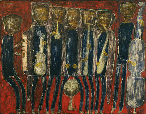
Jean Dubuffet, Grand Jazz Band (New Orleans), 1944
George Condo, The Laughing Cavalier, 2013
The solid primary color choice combined with the black lines at the top of the figure recall Piet Mondrian, and the seeming carelessness of application of paint in the background areas recall the found object paintings of Nicholson from his period in St. Ives. And of course, the entire work begs at least a nod to Cubism through its broken space. While Condo may not be leveraging the same questions about form and space that Picasso and Braque did, he is certainly not shying away from cubed space. I can even see Duchamp too, Nude Descending a Staircase.

Piet Mondrian, Trafalgar Square, 1939

Georges Condo, Detail from The Laughing Cavalier, 2013

Ben Nicholson, Winter Blue, 1969

George Condon, detail from The Laughing Cavalier, 2013

Pablo Picasso, Woman with Pears, 1909

George Condo, detail from The Laughing Cavalier, 2013

Georges Braque, Man with a Guitar, 1911-1912
What now? There are all of these visual comparisons, but what do they do? Is Condo merely referencing these artists, or full on quoting them? If he is quoting them, is he quoting their intentions or just the visual symptoms of those intentions as is potentially the case with Picasso and Braque? Or is he manipulating their styles to his fancy? Is that even the way to unlock these images?
